2 - Data visualization
Article to read https://www.tableau.com/visualization/what-is-data-visualization
Exercise — Read, Summarize, and Present
Work on understanding, analyzing, and explaining a short article.
- Form groups of 2 or 3 students.
- Read the article carefully as a group.
- Prepare a short summary including:
- the main topic,
- the key ideas,
- important concepts or technologies,
- your opinion or reaction.
- Explain the content in your own words.
- One representative of the group will present the summary to the class.
Data visualization, definition
History and definition of data visualization
- Knowing how to present your data is the final step in managing and using data.
As Confucius said (
Confucius was a Chinese philosopher born around 551 BC and died in 479 BC. He is considered one of the most influential thinkers in Chinese and world history), “a picture is worth a thousand words”; we can also say “a chart is worth a thousand data points.” It is also the final phase in the corporate data process: publication.
- Data visualization (Datavisualization or Dataviz) is a discipline aimed at translating information or a message in a visual and graphical way to make data easier for the human brain to understand.
- Data visualization helps extract insights, highlight large datasets, major trends, and outliers. It’s often thought that data visualization is meant for non-experts, but in fact, Data Analysts also rely on it to gain a clearer view of their dataset.
- Data visualization touches on several disciplines. It includes psychological and neurological aspects, graphic and artistic dimensions, as well as marketing and commercial elements.
It fits into the data process once the data has been collected, structured, cleaned, processed, and validated. It can then be integrated into a visualization tool or a simple spreadsheet.
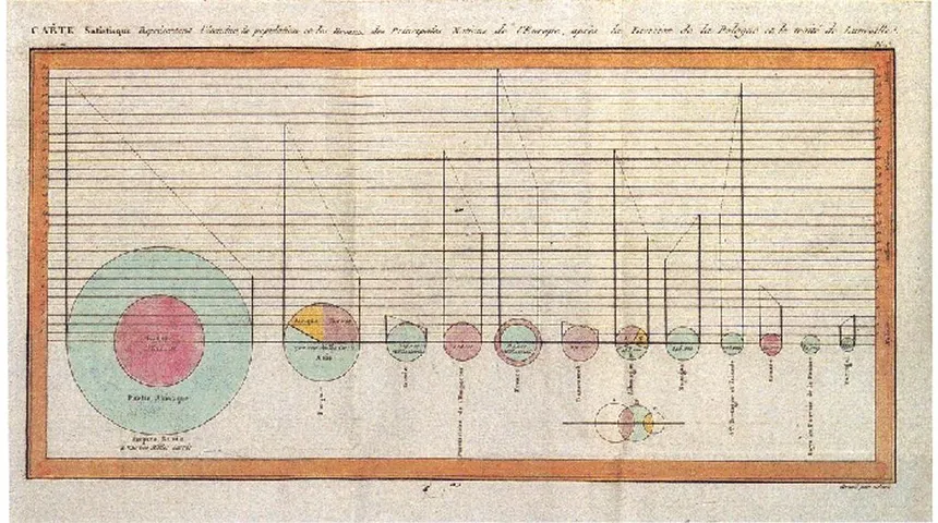
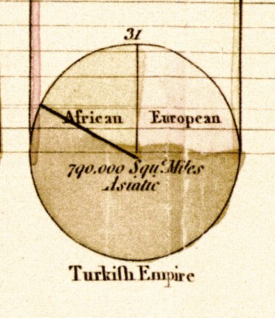
- Data visualization is as old as the history of statistics—perhaps even older, as in the case of cartography. William Playfair, known for being an engineer, spy, speculator, journalist, and even a fraudster... invented in 1901 the charts we know today, specifically the pie chart. He brought the world this way of simplifying and visualizing data.
Pie charts published by William Playfair in The Statistical Breviary (1801)
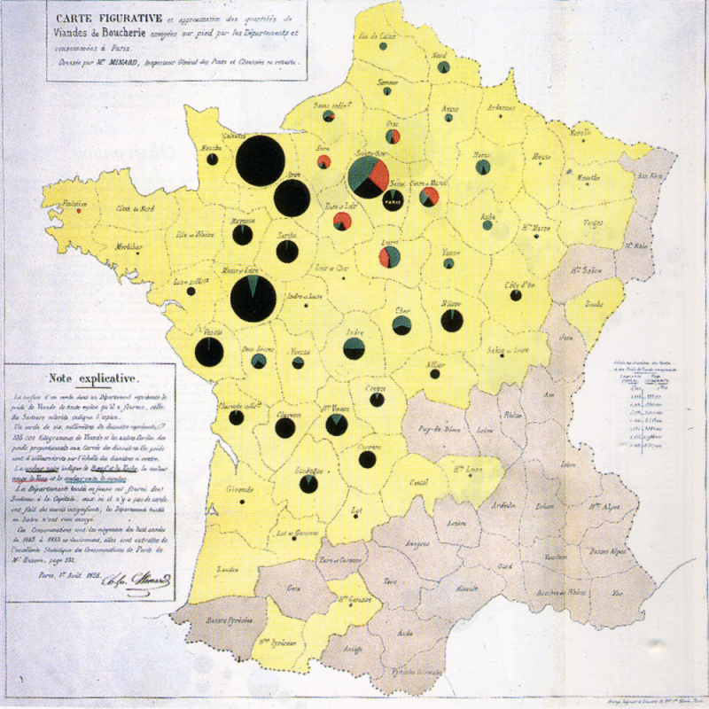
- Map by Charles Joseph Minard from 1858: Figurative and approximate map of the quantities of butcher’s meat sent live by the departments and consumed in Paris.
- This map shows, for the year 1858, the quantities of butcher’s meat sent live (butchery animals transported alive) from the French departments and consumed in Paris. Each proportional circle indicates the total quantity of meat sent by a department, while the colored sectors inside the circle show the breakdown of different animal species (beef, veal, lamb, pork, etc.). The area of each circle is proportional to the total amount of meat sent.
- Data was collected from competent services and compiled to provide an overview of Paris’s meat supply.
- This map was created by Charles Joseph Minard, Inspector General of Bridges and Roads, in 1858.
- It is notable for being one of the earliest known uses of proportional pie charts overlaid on a geographical map to illustrate the distribution and origin of meat consumed in Paris.
Article: https://www.radiofrance.fr/franceculture/a-l-origine-des-graphiques-comment-on-a-mis-les-statistiques-en-images-7493246
- A century and a half later, with the advent of modern computing, data visualization has become increasingly widespread. We now have countless illustration software (Photoshop, Excel, PowerPoint, Word…).
And after several decades, the Internet has connected the world and dramatically increased the volume of data. With the digital era, data visualization has reached its peak.
Specialized tools have emerged, such as:- Looker Studio (formerly Google Data Studio): https://lookerstudio.google.com/
- Tableau: https://www.tableau.com/fr-fr
Visualization and the Human Brain
- Did you know that your brain processes visual information 600,000 times faster than text and retains only 20% of what it reads?
- When presented with information, 90% of what the brain processes is visual. And you won’t be surprised to learn that the most consumed content on the Internet is video, followed by images, and today, PowerPoint presentations have become a classic in businesses because they make information visual and concrete.
- According to a famous statistician named John Tukey, one of the best tools for making surprising data discoveries is the human eye and its ability to read images.
It’s said that the human eye has evolved over time in its ability to detect and avoid danger. Humans see everything, but notice very little, and can’t focus on every element they face.
- Danish physicist Tor Norretranders conducted a study called “The Bandwidth of the Senses.” He analyzed the capacity of our senses to process data.
- According to him, the sense of taste can process 16 bits/second,
- smell, touch, and hearing can process 12.5 megabits/second,
- and vision is at the top with 125 megabits/second—equal to the power of a computer network.
- This study proves the importance of sight and its capacity to process more information than any other sense. It is therefore necessary to adapt and present conclusions visually.
Different Types of Data Visualization
Google search The different types of data visualization
There are various ways to visualize data depending on the type of data, the context, and the audience’s level of knowledge.
Bar Charts
Let’s begin with bar charts. They allow you to represent a numerical series. The height of each bar indicates its value on an x-y axis.
Line Charts
Then we have line charts. These are useful to correlate changes over time within the same axis or comparison period. They also reveal general trends and predictions.
Pie Charts
Pie charts are useful for showing the breakdown of values. Unlike previous charts, they compare data among themselves and highlight outliers.
Maps
Maps are ideal when data has a geographic origin. Their simplicity makes it easy to spot key countries with a color code.
Scatter Plots
Scatter plots reveal trends between two data points. They help identify data clusters and lead to conclusions.
Radar Charts
Finally, radar or spider charts allow you to represent qualitative data on a single plane.
Exercise 2-1
Find examples of data visualization diagrams and others, especially those used in Dataviz.
Data Visualization Tools
There are many tools available for data visualization. Let’s start with the classic ones you may already know.
Office Tools
- Although not specialized in data visualization, they allow you to do it. On Word, for example, you can build a table, add shapes and diagrams using Smart Art tools.
- Excel is ideal—with conditional formatting, charts, and pivot tables, it’s essential for data manipulation (just like Google Sheets).
- Lastly, PowerPoint allows similar representations, with animations and intuitive image and shape handling.
DTP (Desktop Publishing) & Infographic Tools
They aren’t specialized in dataviz either, but let you create whatever you like. Just Google infographic template psd and you’ll find plenty of inspiration from ready-made templates.
Data Visualization and BI (Business Intelligence) Solutions
- The above tools can’t connect to data collection and distribution systems. While there are some add-ons (especially for Google Sheets) to bridge digital analysis tools and spreadsheets, they remain basic compared to data-focused solutions (Microsoft Power BI or Tableau, for instance). Some can connect to your information system (ERP, CRM, servers), others cannot. These bridges are called “connectors” and are used to qualify each tool.
- The native tool for your Data Warehouse
- Google BigQuery and Looker (formerly Google Data Studio).
- Microsoft Azure and Power BI.
- AWS and QuickSight.
Exercise 2-2
This list of tools, can you categorize the tools regarding the classification of Dataviz tools learned in this course? https://data.europa.eu/apps/data-visualisation-guide/tag/data-visualisation-tools
Exercise 2-3
This exercise consists of summarizing a lesson in Excel format, then illustrating key ideas with real-world examples found online, to be presented in a structured Word document or PowerPoint presentation.
Objective
- Summarize a course in a structured Excel table.
- Identify key ideas.
- Find real-world examples online.
- Present everything in a clear and illustrated Word document.
Part 1 — Summary in Excel
- Open Microsoft Excel
- Create a table with the following columns:
Theme / Chapter Key Idea Summary (1–2 sentences) Keywords
- For each course section:
- Note the key idea.
- Summarize it in one or two sentences.
- Add a few related keywords.
- Apply proper formatting: colors, bold text, borders
Part 2 — Structured Word Document
- Open Microsoft Word.
- Draft a document with the following structure:
- Title Page: title, first name, last name, date.
- Introduction: course topic.
- Body:
- For each idea from the Excel table:
- Create a section
- Summarize the idea
- Find a real-world example online (website, article, image, video, etc.).
- Use Google or a free search engine like Qwant, with proper keywords.
- Prefer reliable sources.
- Cite your sources.
- Add a personal comment (Why is it useful? What did you take away?).
- For each idea from the Excel table:
- Conclusion: what you learned and retained from the course.
- Apply styles (titles, subtitles, paragraphs).